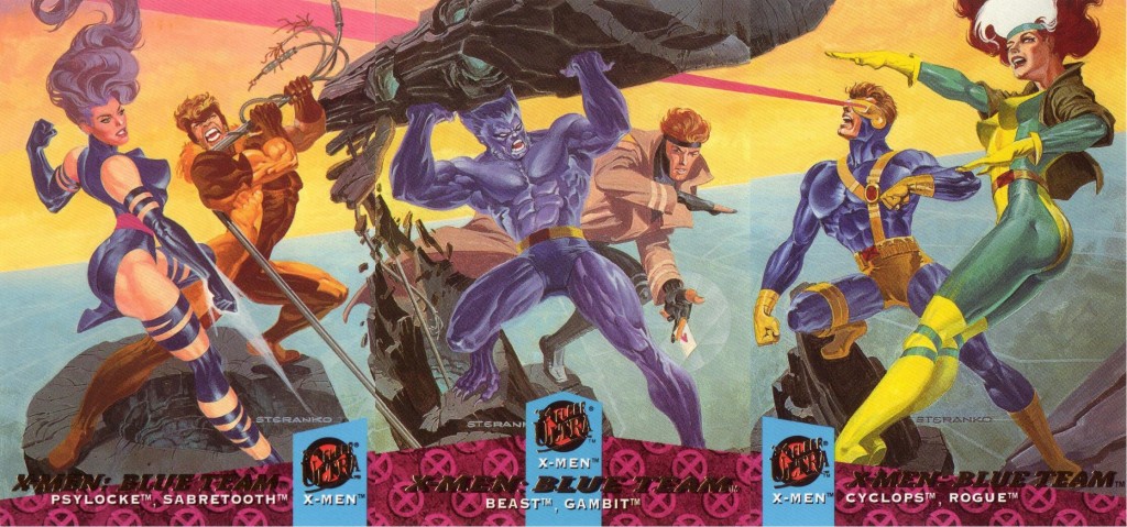
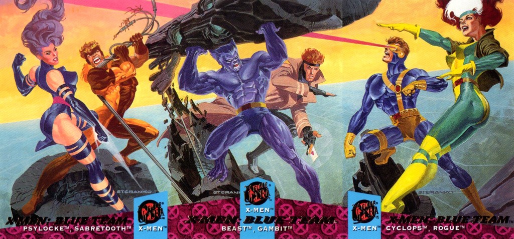
Well today I did some quick manipulation of a scan of 3 trading cards I found on the net and I think it turned out pretty well so I’m sharing it
I could have spent more time on it and made it more perfect but as it is it’s a lot better than the version floating around. I used to collect these cards as a boy along with the ’95 and ’96 series, so this image is very cool for me.
So I started out with the original image which is this:
It’s already amazing just because of the art style and printing quality. However some things aren’t lining up, partly because of the printing process – when cards are printed and cut they are usually not exactly lined up, so you miss things on the edges, making it very hard to find 3 cards that line up perfectly. With Photoshop (or a similar program) we can fix some of that.
First, I cut the image into 3 layers so I can vertically resize and move the 3 cards to get them lining up better.
After doing that, Cyclops and his laser were no longer lined up, which seems to be the main goal the original scanner had in mind (and it’s a good idea, too), so I isolated Cyclops’ head and laser and resized them very slightly to line up. I then did a similar thing on the left side.
Next I isolated some parts of the background and resized/rotated them to fit better.
Then I got rid of some artifacts on the joins between the cards using the Clone Stamp tool.
Then I used the Levels tool to make the blacks closer to black and the whites closer to white, to bring it closer to what the artist drew, instead of seeing it as interpreted by the scanner with its light-pollution.
Lastly I cropped the edges which had become uneven from the initial lining up.
The end result:
Like I said at the start, I could have spent more time manipulating all the joins to make it perfect, but this is good enough and maybe this is a useful resource for someone to show how to do quick manipulations.


